Nobody buys a house or signs a lease from a website. They decide, from a website, which three places are worth a visit. For a builder, a developer, or an apartment community, the site's whole purpose is to get onto that short list and then make booking the visit effortless. We have built sites across this industry, for a development company, for individual properties, and for apartment communities, and the same principles hold at every scale.
At a glance
- Show it, describe it, show the layout. Buyers in NAR's 2025 profile valued photos, property detail, and floor plans most.
- A page for every floor plan. With the drawing, the size, photos of that layout, and a way to ask about it.
- Answer tour requests fast. Forms feed a CRM that confirms instantly and follows up automatically.
- Accessibility and fair housing are requirements. Build them in from the start rather than patching afterward.
Start with how people actually search
The National Association of Realtors' 2025 Profile of Home Buyers and Sellers reports that every buyer surveyed used the internet in their home search. Asked what website content was most valuable, they named photos first (41 percent), then detailed property information (39 percent), then floor plans (31 percent).
That is the priority list for your site, straight from the people you are trying to reach: show it, describe it precisely, and show the layout. Everything below follows from that.
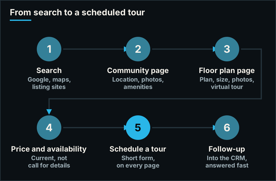
The route a visitor takes. Every page should make the next step obvious.
1. Give every floor plan its own page
A floor plan buried in a PDF is invisible to search engines, awkward on a phone, and impossible to link to. Each plan should be its own page, with the drawing, the bedroom and bathroom count, the square footage, photographs of that layout, and a way to ask about it.
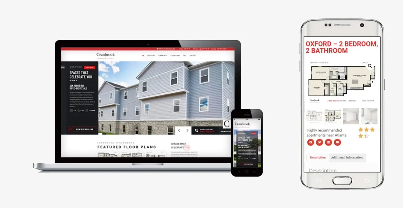
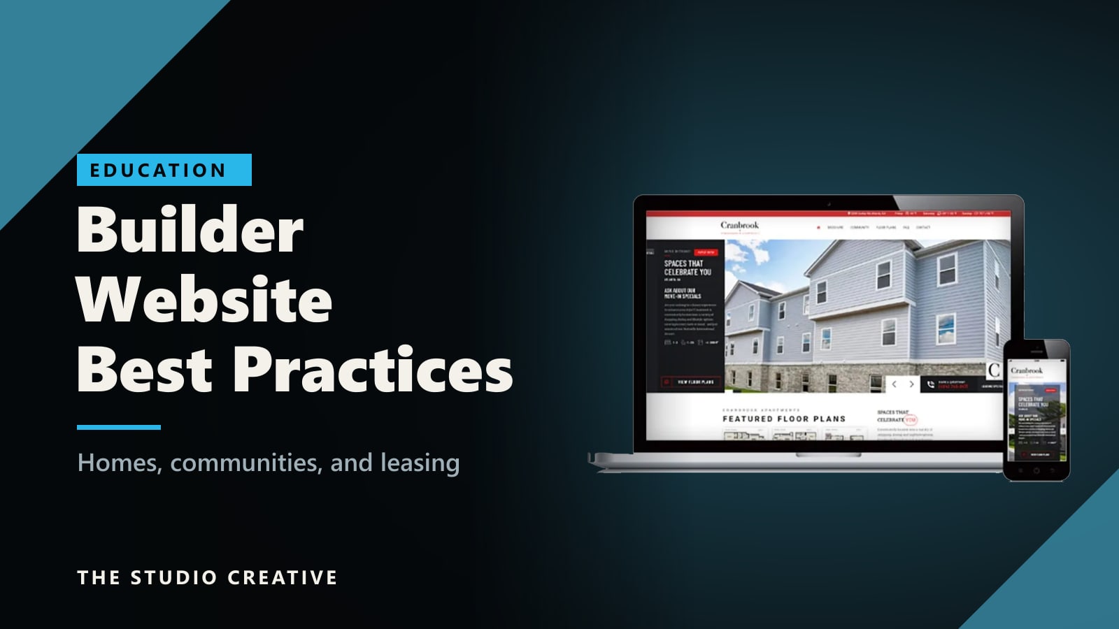
A leasing site we built for Cranbrook apartments. Featured floor plans sit on the home page, and each plan has its own page with the drawing, photos of the unit, the size, and a phone number.
Notice what the home page does. The main button is "View floor plans," not "Learn more" or "About us." The move-in special is stated up front. A phone number stays in view. The site assumes the visitor came to find a place to live and takes them there in one tap.
2. Show what is available, and what it costs
"Call for pricing" reads as "more than you think." Visitors are comparing several communities at once, usually in browser tabs, and the ones that answer the question win the visit. For homes, show base prices and the homes that are ready soon. For apartments, show current availability and rent by floor plan. If a full live feed is not practical, publish a starting price and the date it was last updated, and keep that date honest. A stale price is worse than none.
3. Invest in photography and video before design
Photos are what buyers value most, so the best-designed website in the world cannot rescue poor images. Plan for professional interiors and exteriors, aerial footage that shows the site and its surroundings, a video walkthrough of each model or plan type, and renderings only until the real thing can be photographed.
This is where being a production company helps us. We hold an FAA Part 107 license for commercial drone work, and we have filmed architecture and construction from the air and photographed buildings through construction to opening. When the same team shoots the property and builds the site, the pages are designed around the footage instead of around stock placeholders.
4. Sell the location, not just the building
People choose a neighborhood first. Each community needs a page that answers the local questions: a map, what is nearby, schools, commute times, parks, and shopping. These pages also do the search work. Someone types "new homes near" or "apartments near" a place, and a page about that place is what can appear. One page per community, written for that community, not a paragraph reused with the town name swapped.
5. For developers: show the projects and tell the news
A development company has more audiences than a single community does. Investors, lenders, city officials, brokers, future tenants, and the press all visit the same site, and they are all asking one question: does this company deliver?
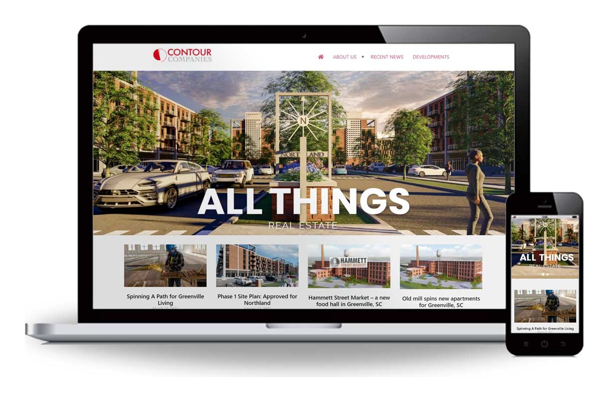
The Contour Companies site. A large project image leads, and current project news sits directly under it.
The answer is a portfolio with facts and a news section that is visibly alive. Site plan approvals, groundbreakings, and openings are worth publishing: they show momentum, and they give journalists and officials something to link to.
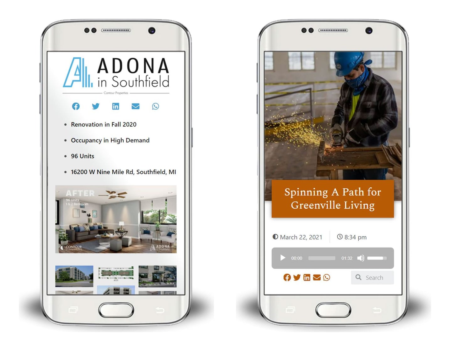
Left: a property page that leads with the facts, including the renovation date, unit count, and address, then shows the finished result. Right: a project news story with an audio player, so it can be listened to as well as read.
- Lead each project with its facts. Location, unit count, status, and dates, before any marketing copy.
- Show before and after. For renovations and adaptive reuse, nothing demonstrates capability faster.
- Make stories easy to share. Share buttons on every project and article cost nothing and put your work in front of the people your partners know.
6. Make the tour request the easiest thing on the page
One primary action, on every page: schedule a tour, or ask about this home. Keep the form to a name, contact details, and what they are interested in. On a phone, make the phone number a button that dials. If someone is looking at a specific floor plan, the form should already know which one.
7. Answer fast, and do not rely on memory
Forms should feed a CRM that confirms instantly, alerts the leasing or sales team, and follows up automatically if nobody has responded. This matters more than any design decision on this list, and it is why we connect the sites we build to a follow-up system rather than an email inbox.
8. Build for the phone first
Much of this searching happens on a phone, in spare minutes, often while standing in front of a competitor's building. Floor plans must be zoomable with a thumb. Galleries must swipe. The page has to appear quickly on mobile data. Design the phone version first and let the desktop version grow from it, not the reverse.
9. Treat accessibility and fair housing as requirements
Housing websites carry obligations that many other sites do not. Industry publications such as Multi-Housing News have covered the growing number of accessibility complaints against property websites. The practical basics: readable contrast, text alternatives for every image, including a written summary of each floor plan, full keyboard navigation, captions on video, and application forms and documents that a screen reader can use.
Apply the same care to the words and pictures. Describe the property, not the kind of person you imagine living there, show a genuine range of people in your imagery, and display the Equal Housing Opportunity statement. This is not legal advice, and your attorney should review your marketing, but a site built with these points in mind from the start is far easier to keep compliant than one patched afterward.
10. Keep it current
A sold-out community still advertised as "coming soon," a special that ended in the spring, a news page that stopped two years ago: each one tells a visitor that nobody is paying attention. Whoever builds your site should make it easy for your own team to update availability, pricing, and news, and should stay involved after launch.
The short version
- A page for every floor plan, with drawing, size, photos, and an inquiry button.
- Real availability and real prices.
- Professional photography, aerials, and walkthrough video.
- A page for every community and its neighborhood.
- For developers: a portfolio with facts, and a living news section.
- One tour request action on every page, with a tap-to-call number.
- Instant, automatic follow-up.
- Phone first, and fast.
- Accessible, and fair housing aware.
- Kept current.
If video is the next step for your communities, our guide to the top reasons to use video covers the case for it, and repurposing one shoot shows how one day of filming at a property becomes walkthroughs, social clips, and photography for the whole site.
Want a second opinion on your website?
If you build, develop, or lease residential property and want a candid review of how your current site handles floor plans, availability, and tour requests, send us the link. We design, build, host, and maintain custom websites from Grand Blanc, Michigan, and we film the video and photography that goes on them, so the site and its content are planned together. Tell us about your project and you will get a real reply from the person who would build it. See how we work on our web design and development page.