The Gazette is set in the editorial office of a small-town newspaper, which is a harder set to fake than a TV newsroom. Nobody has a picture of a TV newsroom in their head that is more specific than "desk, screens, skyline." Everybody knows what a real office looks like. So this episode was built half real and half virtual, on the same table, in the same afternoon, and the seam runs right down the middle of the conversation. This post is about that hybrid, and about which half of the room we chose to build for real.
At a glance
- One real wall. The editor's side is a practical set: a brick wall, a lamp, a shelf and a wall-sized Gazette masthead.
- One green side. The reporters' side is keyed, with a virtual study generated in Studio Projects behind them.
- Shared light, shared table. One warm key, one practical lamp and a real table stitch the two halves together.
- Why that wall. The Studio Projects breakdown showed the editor's side carrying most of the screen time.
Watch The Gazette on its own page.
The set: one wall that is real
Here is the whole trick in one photo. The editor's side of the table is a practical set: a brick wall, a lamp, a shelf, and a wall-sized Gazette masthead behind him. The reporters' side of the table is a green screen. The camera facing the editor sees a newspaper office. The camera facing the reporters sees green, and that side gets its room in post.
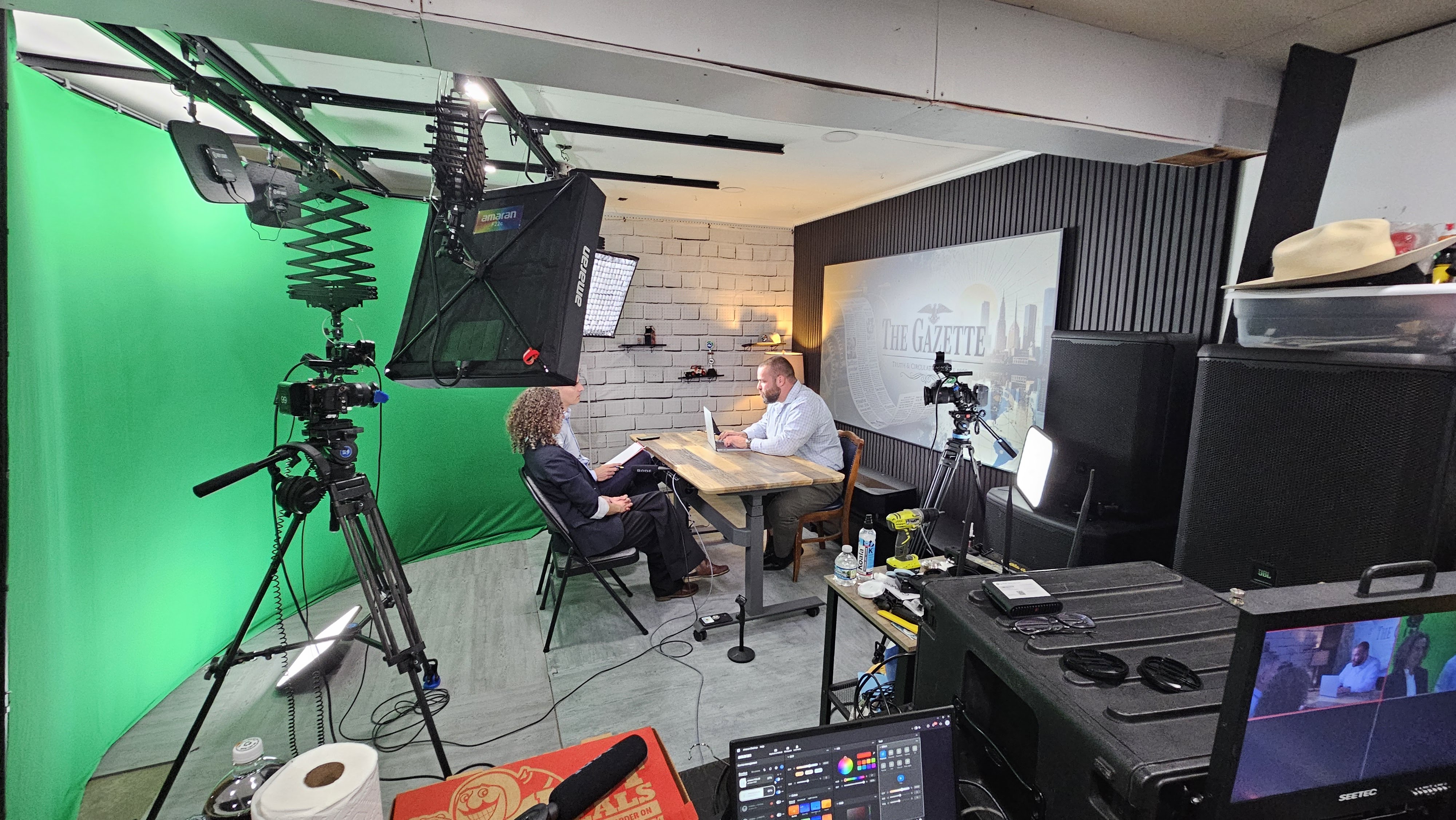
The Gazette set from behind the cameras. Left: the green screen for the reverse angle. Right: the practical wall, the masthead, and the editor's desk. One table serves both.
Why split it that way? The editor's side carries the most screen time and the most detail an audience will study: the masthead, the texture of the brick, the lamp. That is the side worth building. The reporters' side is mostly reaction shots, framed tight, over a shoulder. A virtual room behind two people who are listening reads perfectly and costs nothing to strike.
- The masthead wall. The Gazette front page, blown up to wall size, is the set's single strongest idea. It tells you where you are in one frame, it is a joke in itself, and it makes a plain brick wall look like an institution.
- Shared light. Both sides of the table sit under the same warm key and the same practical lamp, so the real half and the virtual half share one lighting note. The reverse angle's virtual room was generated in Studio Projects to match that warmth, not the other way around.
- The table. Real, and in every shot. A shared practical surface is what stitches a hybrid set together: hands, laptops, coffee, and papers cross the seam and nobody notices there is one.
The two angles
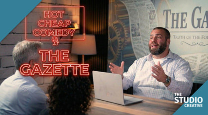
Side by side, this is what the audience sees. On the editor's side, the practical wall does the work. On the reporters' side, the study with the bookshelf, the fireplace, and the framed Gazette front page is a virtual environment keyed behind the performers.
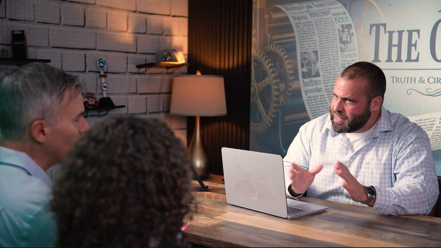
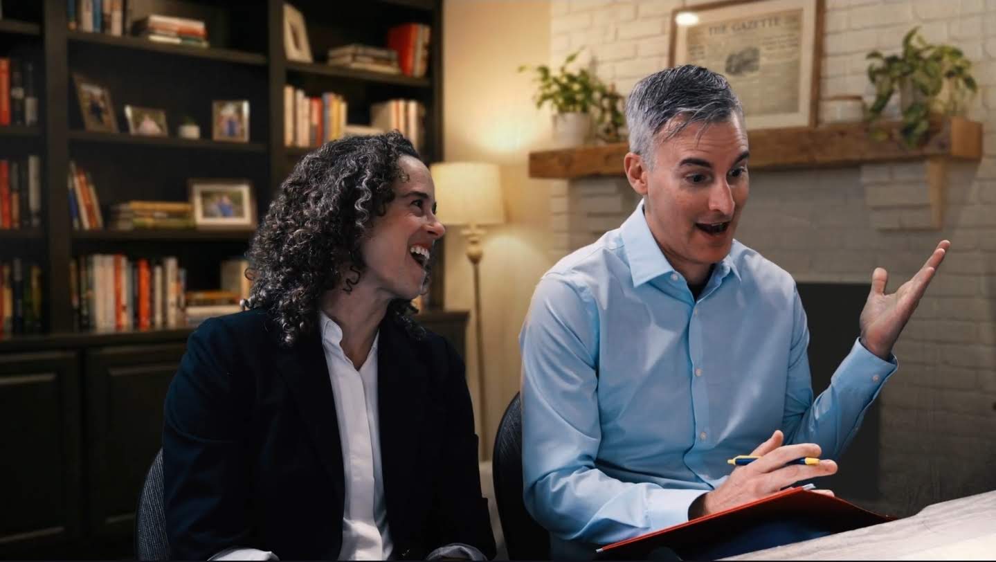
Top: the practical side. Bottom: the green screen side, finished. Same table, same lamp, same afternoon.
Editing: making the seam disappear
A hybrid set lives or dies in the grade. The practical side was shot as-is, so it set the target: warm, slightly soft, a little contrast in the brick. The virtual side was keyed with our spill-suppression chain, then graded to that target rather than to a neutral reference. The framed front page on the virtual wall is the same masthead art as the practical wall, deliberately, so the two rooms feel like one building. The cut alternates angles constantly, which is the real test, and it holds.
Where AI fits in a hybrid shoot
The reverse angle is a two-shot with a lot of hair and a lot of gesturing, which is where a chroma key gets fussy. AI masking pulled the rough garbage matte for every reverse-angle clip automatically, including the edge of the practical set that crept into frame on the wide, and an AI shot-match brought the keyed side into the neighborhood of the practical side before the colorist finished it by eye. The dialogue edit was built from the AI transcript, as every Hot Cheap Comedy episode is now, so the editor chose lines in text before touching pictures.
Studio Projects: deciding which wall to build
The decision about which side of the table to build for real was made with the scene-by-scene breakdown from Studio Projects, the software we built for this series. Upload the script and it lays out each scene with a visual example, describes the characters, and gives a per-character shot list. For The Gazette that showed the editor's side carrying most of the screen time, so that is the side that got the practical wall and the masthead. The study behind the reporters, with the bookshelf, the fireplace, and the framed front page, is a Studio Projects background image generated from the script and enhanced to match the warm practical side. The editor received the breakdown with the footage, so it was obvious which clips needed a key before any of them were opened.
What this means for your brand
Most businesses have one wall worth filming: the lobby sign, the workshop, the shelf with the awards on it. Build that one for real and let green screen supply the rest of the building. That is how a company in Michigan gets a whole "campus" of locations out of a single room and a single day, and it is the same pipeline we run for brand films and recruiting videos.
Want this pipeline for your brand?
Everything in this post, from the green screen stage and the generated backgrounds to the AI-assisted edit and Studio Projects itself, is the same pipeline we use for brand films and commercials out of Grand Blanc, Michigan. If you want more video without a bigger budget, tell us what you're making and you'll get a real producer's reply, not a rate sheet. Browse the rest of the series on our work page.