Most companies that feel inconsistent do not have a bad logo. They have a logo with no system around it, so every supplier, new hire and social post invents its own version, and buyers meet five slightly different companies. This guide is the difference between a logo and a brand identity, in plain words, so you know what to ask for before anyone draws anything. We design identities for companies and then put them on their websites and in their videos, so we see where the gaps show up.
At a glance
- A logo is one mark. A brand identity is the logo, its versions, the colors, the type, the voice and the rules for using them.
- One logo becomes six. Primary, stacked, icon, one color, reversed, and the clear space around them. Most businesses are handed one JPG.
- Know what a quote includes. Concepts, revision rounds, file formats, typeface licenses and who owns the files decide whether two prices are comparable, and the rollout usually costs more than the design.
- Refresh before you replace. If the name and the idea still work, the system around the mark is usually what is missing.
1. What the two words mean
A logo is a single mark: the symbol, the name set in a typeface, or both together. It is the thing people point at.
A brand identity is everything that makes your company recognizable as one company, wherever it appears. It has four layers, and they are built in this order:
- Strategy. Who you serve, what you stand for and what sets you apart, written down before anything is drawn. Every concept is judged against it.
- The visual system. The logo and its versions, the colors with exact values, the typefaces, the kind of photography you use and the layout rules.
- Voice and messaging. A positioning line, a tagline if you want one, a boilerplate paragraph and a few words on how the company sounds.
- Guidelines and application. The rules written down, and the brand carried onto the website, the cards, the signs, the posts and the videos.
Buy a logo on its own and you get layer two, half finished. That is why a beautiful new mark so often changes nothing: the proposal template, the van and the Instagram grid all carry on as before.
2. The four kinds of logo
Every logo falls into one of four kinds, and knowing which one you want saves a round of concepts.
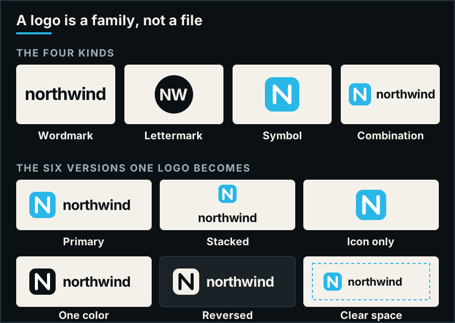
The four kinds, and the family one combination mark turns into. The mark here is a placeholder drawn for the diagram, not a client's.
- Wordmark. The name itself, set in a typeface chosen or drawn for it. Suits a distinctive name you want people to learn and say.
- Lettermark. Initials built into one compact mark. Suits a long name, or a company already known by its initials.
- Symbol. A shape that stands for the company without words. Suits a brand with the reach to be recognized by the shape alone, or one that needs a tiny app icon.
- Combination mark. A symbol and a wordmark that work together or apart. Suits most companies: the name teaches the symbol, then the symbol stands on its own.
3. One logo becomes six versions
A finished logo is delivered as a family, each version with a job. Ask for all six, in vector files for print and PNG or SVG files for the web:
- Primary. The horizontal lockup, used wherever there is room.
- Stacked. Symbol over name, for square spaces and narrow columns.
- Icon. The symbol alone: app icons, favicons, social avatars.
- One color. Embroidery, engraving, one-color print, the pen.
- Reversed. Light on dark: signage, video, dark screens.
- Clear space and minimum size. Not a file but a rule: the margin nothing else may enter, and the smallest size each version may be used at.
Three tests tell you whether a logo will survive real life. Is it still readable at 16 pixels, and on a pen? Is it still itself with the color removed? Can you recognize it from across a trade show hall? A logo that fails one of them is not necessarily wrong, but it needs the system around it before it goes on anything.
4. What the identity has to include beyond the logo
These are the pieces that make everything your company produces look and sound like one company. If a quote does not name them, it is a logo quote.
- Colors with exact values. One or two primary colors and a few supporting ones, each with print values (CMYK, and Pantone if you print often) and screen values (HEX and RGB). The same blue typed by eye in five tools is five blues.
- Typefaces, licensed. One face for headlines and one for text, or a family that does both, with licenses that cover print, web and desktop use for the people who will use them.
- Voice and messaging. A positioning line (for whom, your company is the what, that differs how), a boilerplate paragraph reused word for word, and three tone words with an example sentence each.
- A short brand guide. Every logo version with where it goes, misuse examples, the colors, the type, the voice, and where the master files live. Short beats thorough: a guide nobody opens protects nothing.
- The everyday templates. Business cards, letterhead, email signatures, and the proposal and presentation templates people use daily. Consistency should take no effort.
5. Refresh or start over?
A new identity is the right call when the name no longer fits, when the company has changed what it sells, or after a merger. A logo refresh is the right call more often than people expect: if the name and the idea behind the mark still work, a refresh modernizes it, fixes what fails the three tests, and builds the versions and the rules around it, without throwing away the recognition you have already earned. It is the smallest branding project there is, and for many established companies it is the whole job. One caution: a refresh cannot fix an unclear message, weak differentiation or a company whose relevance is slipping. Those are strategy problems, and a better-drawn mark does not reach them; start at layer one instead.
6. What it costs, and what to ask
Prices spread widely because "a logo" is not one product. It can mean three concepts and a PDF, or a researched mark with full usage guidelines, and the two are priced like the different jobs they are. In 2026 the market runs roughly like this:
- A logo on its own: about $300 to $2,000 from a freelancer or a small studio. Under $300 is a risk if the mark has to last more than a year or stand for a real business.
- A logo with the thinking: $1,500 to $6,000 when it comes with research into your market, a few genuine concepts, a couple of revision rounds and usage guidelines.
- A full brand identity: $5,000 to $20,000 for the logo system, palette, type, guidelines and templates. Full-service agencies start around the low end and climb into five figures quickly.
Marketplace prices average far below all of these, which is why a marketplace quote and an agency quote are rarely for the same thing. Two costs sit outside almost every quote and belong in your budget anyway: trademark registration, and the rollout, the printing, signage, vehicles and templates that often cost more than the design itself. A refresh is cheaper than a new identity, but it still runs two to three times what a cheap logo costs, because the system around the mark is the work. Our own packages page groups these ranges into three bands and says what each one includes; the price for your company is a fixed quote after discovery.
Whatever the number, ask these before you sign, because they decide whether two quotes are for the same job:
- How many concepts will we see, and how many rounds of changes are included?
- Will the concepts be shown in real use, on a sign, a site, a card and a video frame, rather than floating on white?
- Which versions and file formats are delivered, and is the source file included?
- Do we own the final logo and files outright once we have paid? (With us, yes.)
- Are the typefaces licensed for us, and for which uses?
- Who carries the identity onto the website, the video and the signage, and will it match?
7. Where the brand has to show up
An identity is only finished when it has been carried onto the things people actually see. List yours, then build in the order customers meet them: the website header and favicon, the social avatars and cover art, email signatures, cards and letterhead, proposals and decks, then signage, vehicles and trade show displays. Two places are easy to forget and hard to fix later. Video: an animated logo, name titles and title cards in the brand type, so the brand film and the live stream match the print. And events: the one piece of branding that lands in the frame every time someone is handed a microphone is a mic flag with your logo on it.
Here is what the finished system looks like for two companies we designed: one logo carried onto the things each business actually uses.
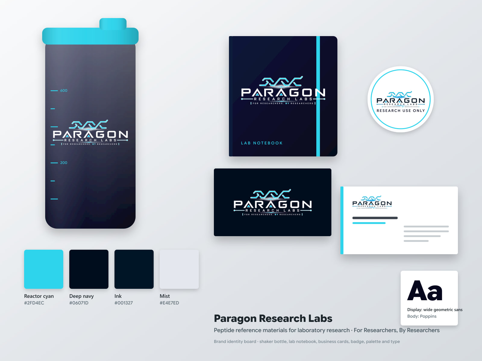
The Paragon Research Labs identity on a shaker bottle, a lab notebook, cards and a badge, with its palette and type sample.
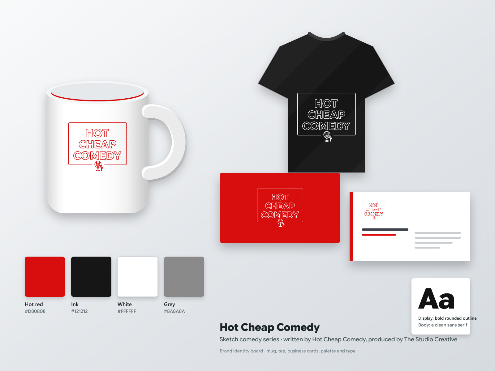
The Hot Cheap Comedy identity on a mug, a tee and cards. Different company, different items, the same idea: one logo, every version, one set of rules.
Frequently asked questions
Can I just get a logo?
Yes, and it is the right purchase for a brand new venture that needs something on the door this month. Ask for all six versions and the vector files anyway, so the system can be built around it later instead of starting again.
How long does a brand identity take?
About six to eight weeks for a full identity, from the discovery workshop to final files and guidelines. A logo refresh runs the same steps in about three weeks. Rolling the identity out across signage, vehicles and templates adds time at the end, in the order your company needs them.
Do I own my logo?
You should, and you should ask. Once a project is paid, the final logo and brand files, including the source files, should be yours outright. Typefaces, stock photography and illustration carry their own licenses, so ask what is covered before anything is printed. This is general guidance, not legal advice; trademark registration is a separate step worth a conversation with a professional.
Want a second opinion on your brand?
If you are not sure whether your company needs a refresh or a new identity, send us the logo you use today and where it shows up. We design brand identities from Grand Blanc, Michigan, and we build the websites and film the videos they go on, so the logo arrives everywhere looking the way it was drawn. Tell us what you have today and you will hear back with an approach, a timeline and one fixed quote, usually the same business day.